

Is a Mobile-Friendly Website Really Necessary in 2026?
Most of your visitors are on a phone. Why a mobile-friendly website is now essential, not optional — what it means, and what a site that fails on mobile costs you.
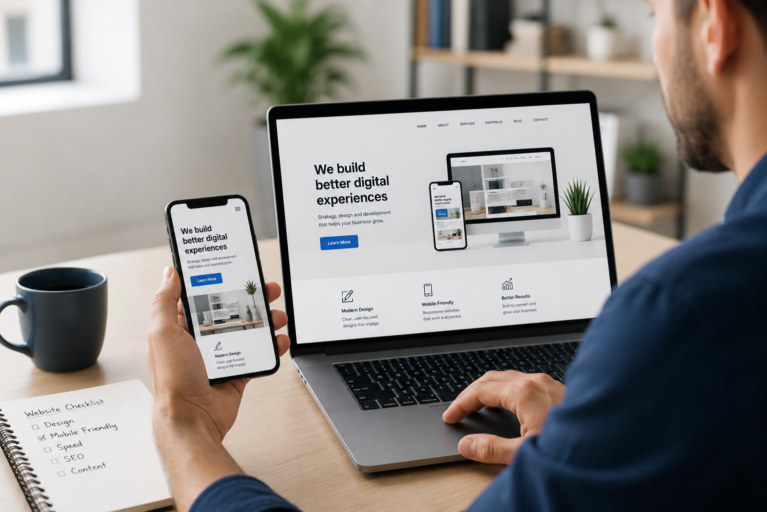
The short version
- Most people will visit your site on a phone. If it's clunky on mobile, most of your audience gets your worst version.
- Mobile-friendly isn't a feature to add on — it's the baseline. Google ranks the mobile version of your site, not the desktop one.
- A site that fails on mobile quietly loses enquiries: people don't struggle, they just leave and try a competitor.
- The fix is mobile-first design: build for the phone first, then scale up, so your biggest audience gets your best experience.
There’s still a version of this question floating around from a decade ago: “do I really need my site to work on mobile?” In 2026 it’s settled. Most of the people looking you up are holding a phone, and if your site fights them there, you’re losing business, you just can’t see it happening.
Here’s what mobile-friendly actually means, why it’s now a baseline, and what a site that fails on phones quietly costs you.
Is a mobile-friendly website necessary in 2026?
Yes — it’s essential, not optional. Most visits to most small-business websites now come from a phone, so a site that’s slow or awkward on mobile gives the majority of your audience your worst experience. Google also ranks the mobile version of your site, so a weak mobile site drags down your search visibility for everyone. There’s no serious case left for skipping it.
What does “mobile-friendly” actually mean?
A mobile-friendly website:
- Loads fast on a phone and a mobile connection
- Fits the screen — no pinching, zooming or sideways scrolling
- Reads easily — text big enough without squinting
- Taps easily — buttons and links you can hit with a thumb
- Keeps everything — the same content and features as the desktop version, not a stripped-back afterthought
If someone can find what they need and enquire comfortably one-handed on the couch, you’re there. If they’re zooming in to read your phone number, you’re not.
Why the mobile version is the version that counts
Two things make mobile the main event, not a courtesy:
Your visitors are there. Referrals, ads and Google searches increasingly happen on phones. The desktop experience matters, but it’s no longer where most first impressions are made.
Google looks at mobile first. Under mobile-first indexing, Google predominantly uses your site’s mobile version to decide how you rank. If your mobile site is slow, or hides content that’s on desktop, that can pull down your rankings — even for people searching on a computer. It’s tied to Core Web Vitals, where mobile speed is scored directly.
So the phone version isn’t a smaller copy of the “real” site. For search and for most visitors, it is the real site.
What a bad mobile experience costs you
Here’s the quiet part: people don’t email to say your site was hard to use on their phone. They just leave.
A visitor lands from a Google search, the text is tiny, a button won’t tap, it’s slow, and within seconds they’re back to the results, clicking a competitor whose site just worked. You get no bounce alert, no missed call. The enquiry simply never arrives. It’s the same invisible loss a slow or weak site creates — you can’t miss customers who never got in touch.
Mobile-first: build for the phone first
The best way to get a great mobile site isn’t to design for desktop and squeeze it down. It’s mobile-first: design for the phone first, then scale up to bigger screens. Starting on the small screen forces clarity — you keep what matters and cut what doesn’t, and the desktop version inherits that discipline.
Every site we build starts this way, because the phone is where most of the audience is. When we built Castle Hill Speech & OT, a warm, easy mobile experience was the priority — parents look up a therapist on their phone, often one-handed with a kid on the hip, and the site had to make that effortless.
It’s also one of the things that make a website good in the first place, not a separate box to tick.
How to tell if your site is mobile-friendly
Do the simple test: open your website on your own phone.
- Does it load quickly?
- Can you read everything without zooming?
- Can you tap the menu, buttons and phone number easily?
- Can you get from landing to enquiry without frustration?
If any answer is no, your biggest audience is hitting the same wall — and it may be one of the clearer signs your site needs a redesign.
Want an honest check of how your site performs on a phone, and what it’s costing you if it doesn’t? Ask us to take a look. We build every site mobile-first, so your best experience reaches the people most likely to become customers.
Frequently asked questions
Is a mobile-friendly website necessary?
Yes. Most people now visit websites on a phone, so a site that's hard to use on mobile gives the majority of your audience a poor experience. Google also ranks the mobile version of your site, so a weak mobile site hurts your search visibility too. In 2026 it's a baseline, not an extra.
What does mobile-friendly actually mean?
A mobile-friendly website loads fast on a phone, fits the screen without pinching or zooming, has text you can read and buttons you can tap easily, and keeps the same content and features as the desktop version. It works comfortably one-handed on a small screen.
Does Google rank mobile-friendly websites higher?
Google uses the mobile version of your site for ranking — this is called mobile-first indexing. A site that performs poorly on mobile, or hides content there, can rank lower for everyone, including desktop users. A strong mobile experience supports your rankings.
What's the difference between responsive and mobile-first design?
Responsive design means one site that adapts its layout to any screen size. Mobile-first design is an approach where you design for the phone first, then scale up to larger screens. Mobile-first usually produces a better phone experience because the small screen drives the decisions.
Sources
Want a hand with this?
We do exactly this. Take a look at Web Design, or start with a free check.